Making the Work Order Less Work
End-to-end redesign of the Work Order experience, one of the most heavily used workflows in Cetec ERP
Understanding the Product
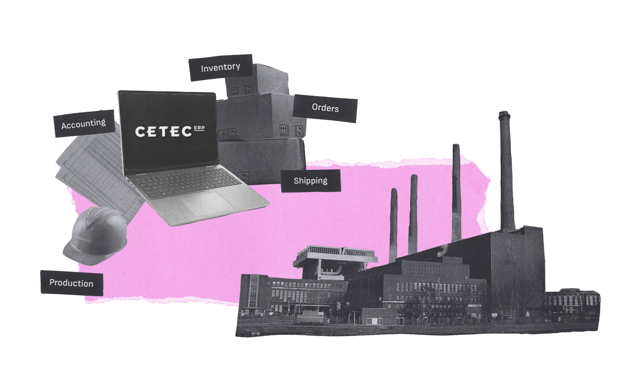
What is Cetec ERP?
Cetec is a web-based ERP that manufacturers use to run their business, including inventory, order handling, labor and parts management, and more.
You can think of it as a factory's digital brain.
Simply put, it's a lot of complexity in one system.
The Feature In Question
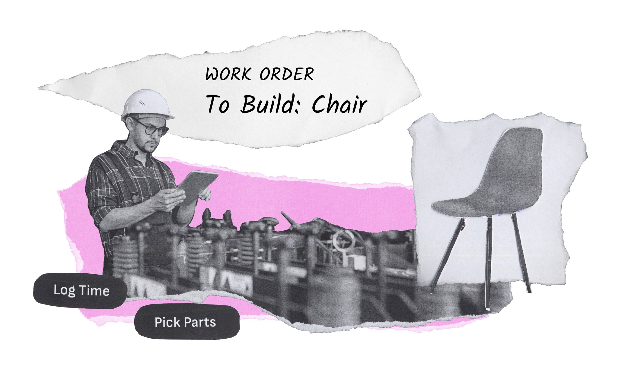
At the Heart of It All: The Work Order
The Work Order holds all the materials, steps, and labor details needed to build a product and is central to what happens on the factory floor.
It’s like a recipe, punch card, and progress tracker rolled together, and lots of people rely on it daily, from floorworkers and supervisors to upper management.
The Problem
The Current Experience was Functional but Clunky
Yes, the Cetec Work Order is at the heart of building products, but it had become a bit of a Frankenstein as functionality was added to it over time.
Sales and Support often heard that the interface was overwhelming and hard to use.
With so many users depending on the Work Order each day, improving the experience was a key opportunity.
Our Goal
Make the Work Order simple, intuitive, and easy to use

The New Design
Want to jump straight to the solution? Check out the redesigned Work Order homepage designed for Floorworker ease of use.
Internal Perspective
Internal Stakeholder Interviews
Hearing from stakeholders in Leadership, Engineering, Sales, Support, and Marketing helped me to understand how the business thinks about the Work Order as well as technical or strategic constraints that I should consider.
rewrite voice
Key Stakeholder Insights
The Work Order is one of Cetec's most used experiences
There are two main users: Managers who want clear digestible data and Floorworkers who prioritize ease of use
Sales often uses the Work Order in demos, so the new design could impact new business
User Perspective
Watching Real Work Happen
After understanding the internal perspective, I needed to hear from actual users.
I met with 8 users across 5 manufacturers that produce a variety of products, ranging from wire harnesses to biomedical devices. In these sessions, users walked me through how they use the Work Order in their own environment, pointing out frustrations and showing their workarounds.
These interviews gave me a strong foundation for understanding user needs, different usage scenarios, and where improvements would make the biggest impact.
Key 'Show Me Session' Insights
Assessing the Current Design
Understanding What We are Working With
I started by diving into the user interface to understand challenges that users face

Limited Visibility
Users must scroll a carousel to see the full scope of the Work Order, requiring them to hold information in memory

No Clear Call to Action
The primary actions of the Work Order are to log time and move location, but these buttons are tucked away
Buttons for key actions don't include labels, only icons that not everyone understands

Clunky Instructions
Instructions are hard to access and understand
Instructions, referenced documents, and supporting images live in separate disconnected places

Difficult to Access Images and Essential Documents
To access images and documents needed to get their job done, users must leave their context and hunt for information
Focusing on Where We Could Help the Most
With a clearer picture of user needs and opportunity areas, we decided to focus our V1 redesign on floorworker users because their needs are more specific and consistent. We also focused on the Work Order homepage because we wanted to provide users with a good jumping off point.
We plan to address managers in future iterations, but improvements aimed at floorworkers will benefit everyone because of the improved access to information and better process visibility.

Defining our Core Goals
Give users everything they need in one place
Improve how instructions are displayed and how forms are filled out
Make it easier to see where a part is on the shop floor
Early Iterations & User Feedback Sessions
With these goals in mind, I created a new design for the Work Order, using my research findings and stakeholder input to guide decision making. I aimed to streamline and simplify while also taking the Cetec design system into consideration.
I built an interactive prototype and met with 4 Cetec users to get feedback. As users walked through task flows with the new design, I heard their thoughts about understandability, usefulness, and practicality.
Overall, these sessions confirmed that the redesign was moving in the right direction and gave me the final refinements I needed to make the design stronger and more usable.
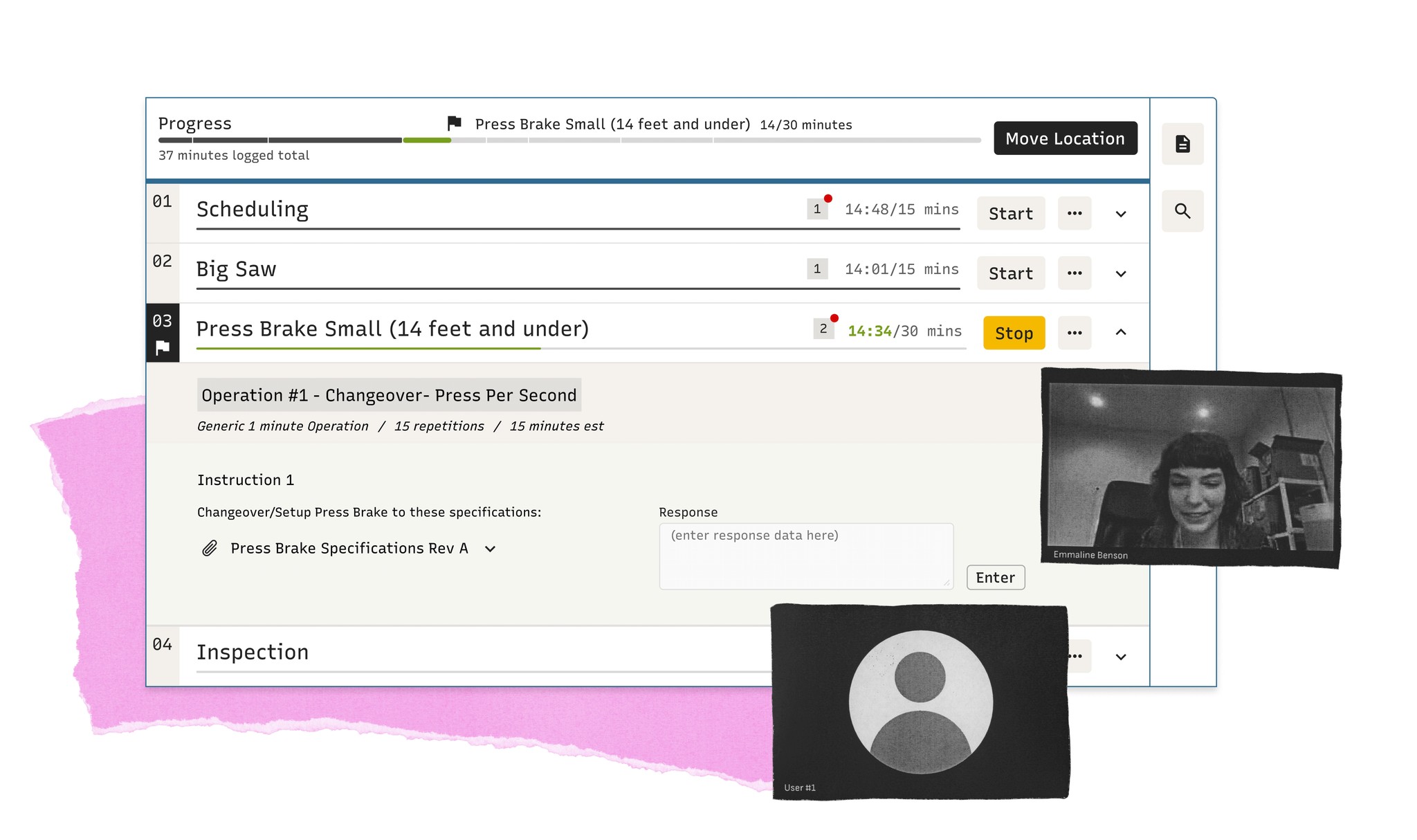
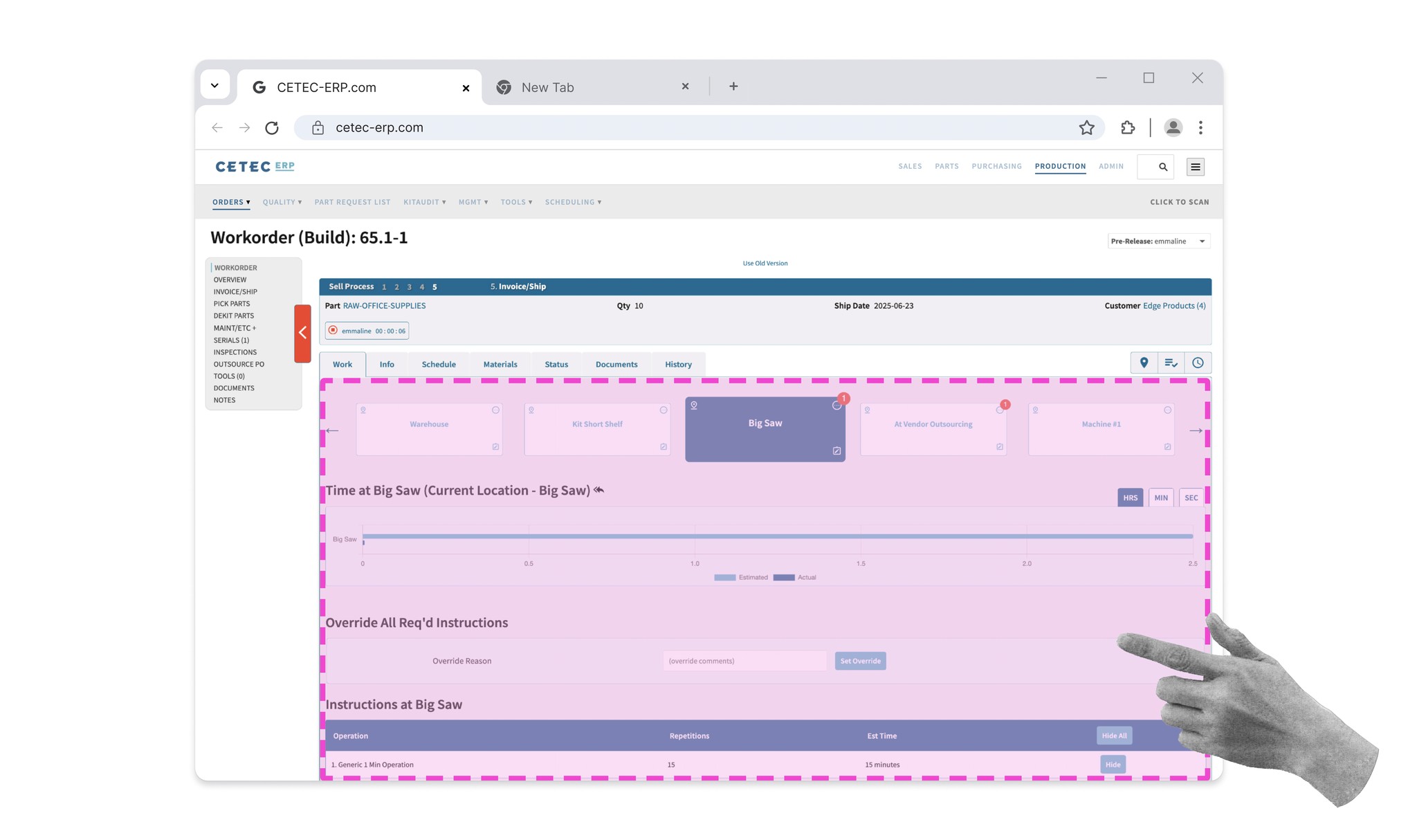
Illustration with an early Work Order iteration
Improved Instruction Readability
“
I like the big fonts for the main sections. That is one thing that's hard to see when you're scrolling through a labor plan normally.
So being able to differentiate the main locations versus the sub operations is nice.
”
-Director of Manufacturing
Improved Instruction Readability
“
This does seem like it'll fix the guys starting work on the wrong location. Cause it's not just one start work button.
What's happening right now is they start work on the wrong location. They forget to change it.
”
-Production Floor Manager
Improved Instruction Readability
“
Sometimes they (floorworkers) don't really need to see the pictures.
Sometimes it's kind of complex and having the instructions and the pictures visible at the same time are beneficial.
”
-Production Floor Manager

Improved Instruction Readability
“
They (management) would love to have that (inline images) there and that would be nice for us too.
So that we're not like rifling through pages, it would just be right there where we needed it. Currently it's a physical piece of paper we're looking at
”
-Floorworker
User Feedback TLDR

Introducing a New and Improved Work Order
The new design brings clarity, flexibility, and ease of use to the Work Order experience and fits within the existing Cetec ecosystem, enabling the team to develop and deliver value to customers quickly.

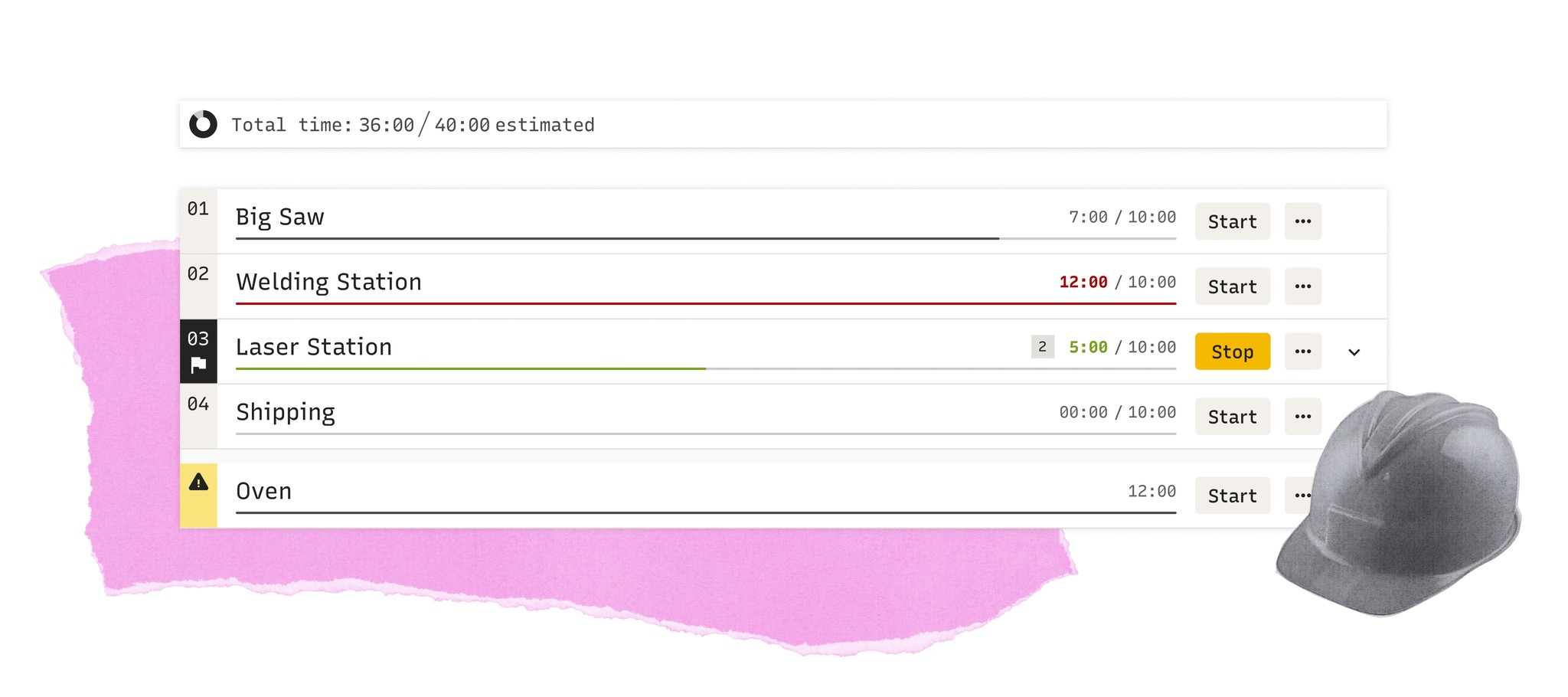
Goal: Everything in One Place
Essential functions easy to access
Multiple 'Start' work buttons allow users to easily start work on the correct location
Goal: Everything in One Place
Information at Your Fingertips
Documents and images can be accessed inline and previewed while maintaining the ability to download, if needed
Goal: Improve Instructions & Forms
Information in context
Steps can be further expanded to show relevant instructions
Goal: Improve Instructions & Forms
Supporting Custom Needs
Companies with strict regulatory requirements can easily customize and embed forms to meet their specific needs
Goal: Improve Visibility of Progress
Always Available Time Spent
At a glance, Managers can assess a Work Order's progress
Goal: Improve Visibility of Progress
Always Available Chronological Progress
Floorworkers can easily understand where they are and what's left to be done on the Work Order
Time to Build!
I created a developer hand-off document that outlines every component of the new design and how they should behave across different scenarios, including edge cases, visual states, and interactions.
Writing this document was a great exercise in clarity as I needed to think through each part of the system and ensure that all behaviors were captured and understandable.
Clarity was also key as my development team was in India and I needed to make sure that they could rely on the document to get the information since I couldn’t be there in person.

Cetec Version 4.23
Expected Release Q4-2026

Final Thoughts
This internship was a crash course in real-world UX. I had the chance to work on a meaningful product design challenge that involved collaborating with people from different departments and across the world, and importantly, working directly with users.
My user interviews and design feedback sessions were a real highlight. Being able to hear from people who use the Work Order as part of their daily job gave me unique insights and helped me to advocate for improvements. I kept these people in mind throughout my design process and reflected on them when I made design decisions. The user research also connected the product team with users in a new way. Seeing how people used the product in the real world was an eye opener for everyone!
