Realm of the Unicorn
Goal: Create an exhibition catalog for a museum that tells the story of a fictional exhibit while making design decisions to organize the content and immerse the viewer.
Role: Design Lead
Timeline: 3 weeks
Research | Layouts | Publication Design
Overview
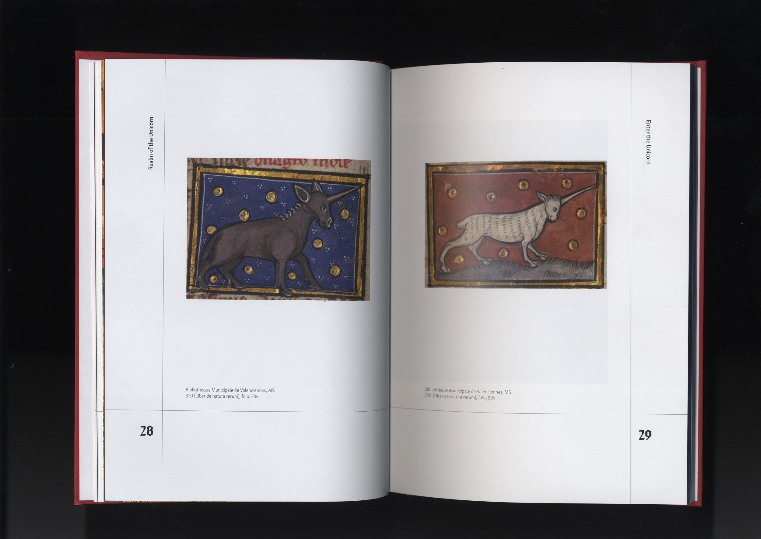
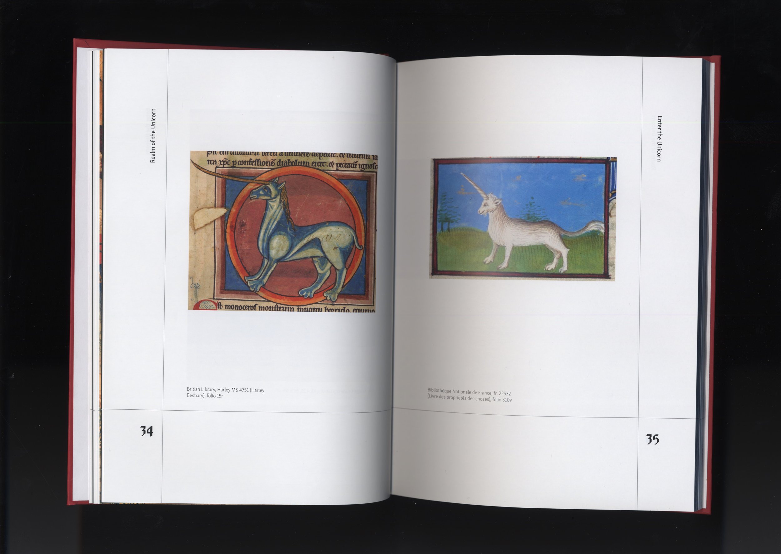
An exhibition catalog serves as a take-home extension of a museum exhibit, documenting the artwork and themes presented. For this project, I curated a fictional exhibition and designed a fully produced catalog to accompany it. Inspired by my love of horses and medieval history, I chose to explore the depiction of unicorns in medieval illuminated manuscripts.
Research and Ideation
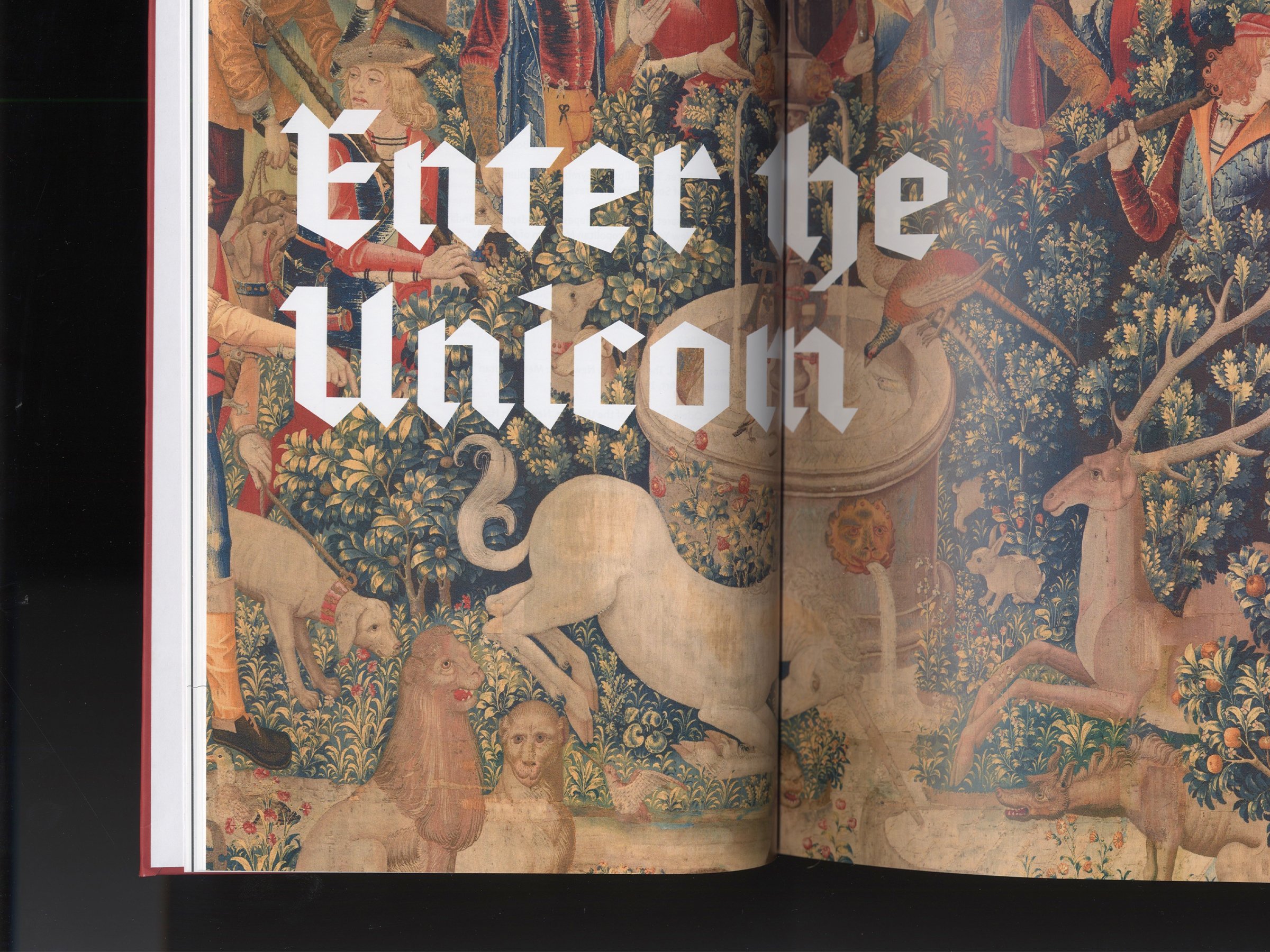
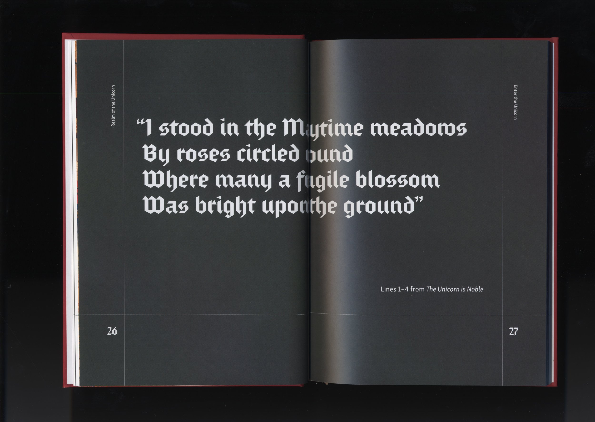
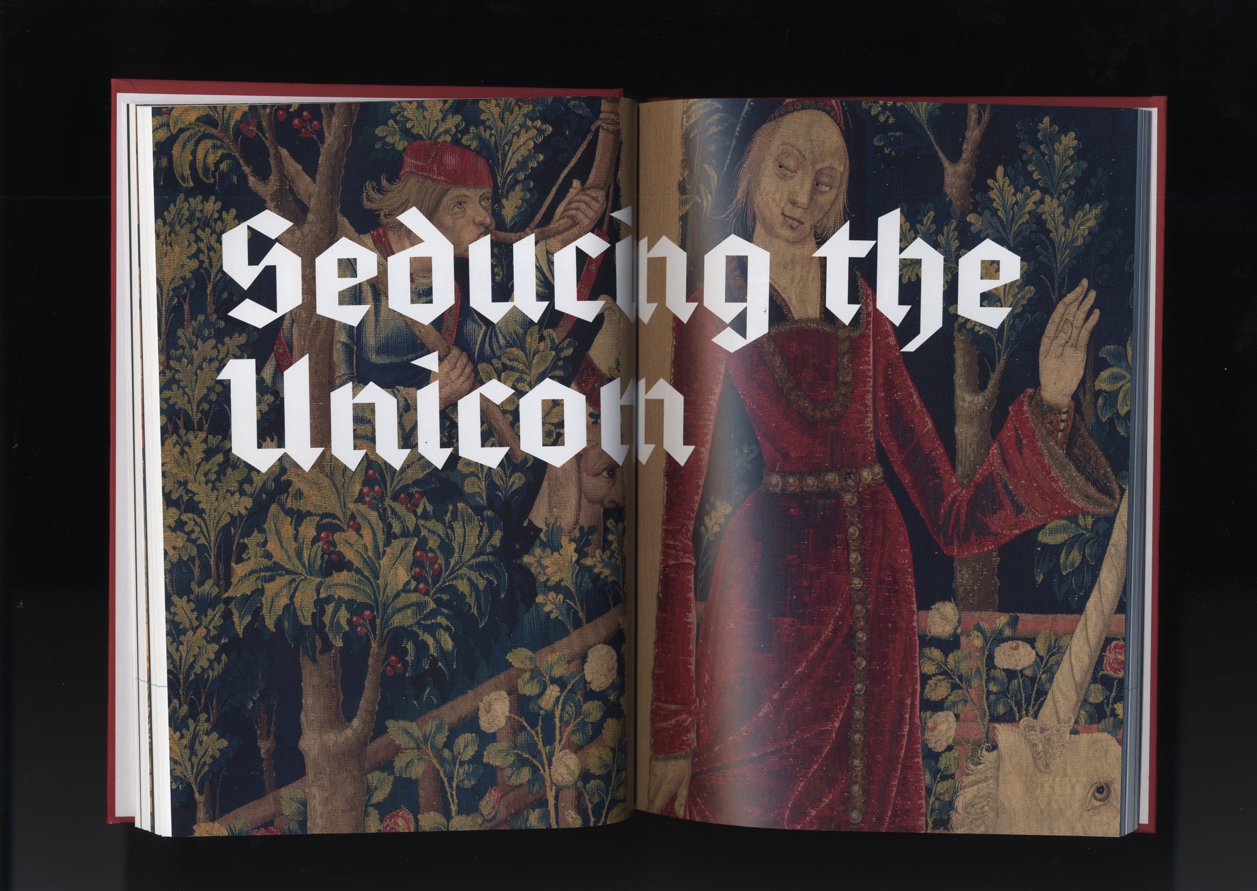
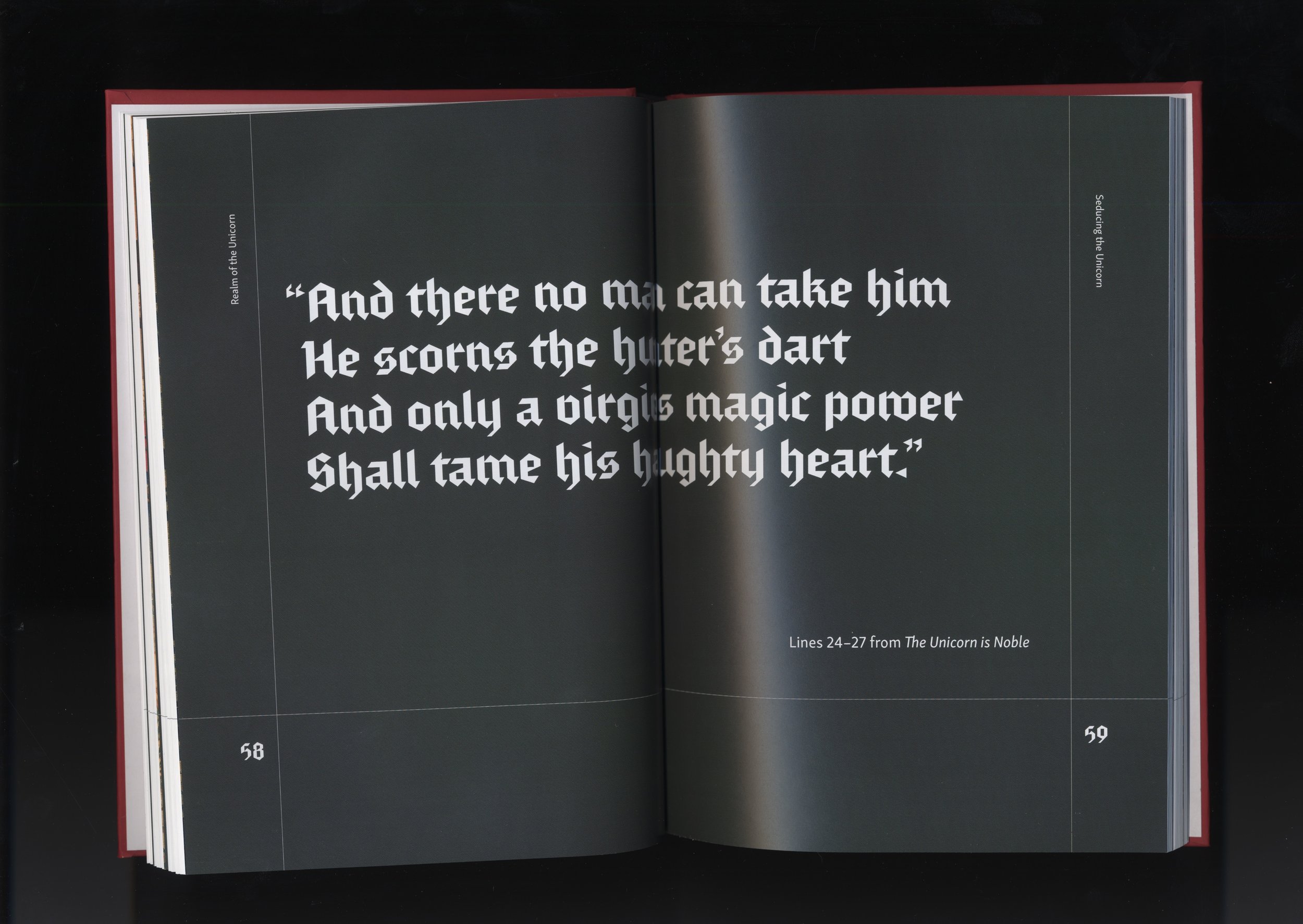
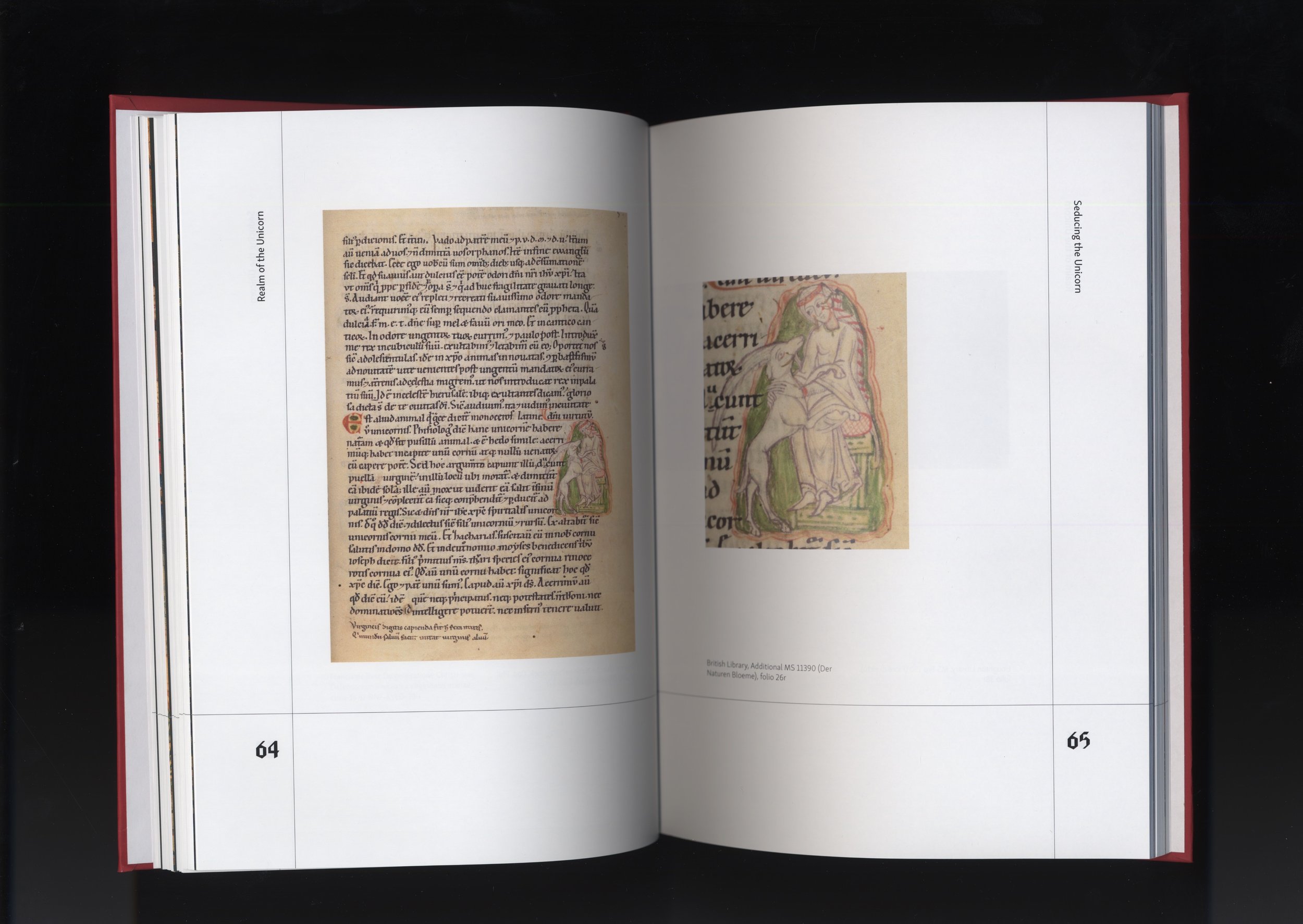
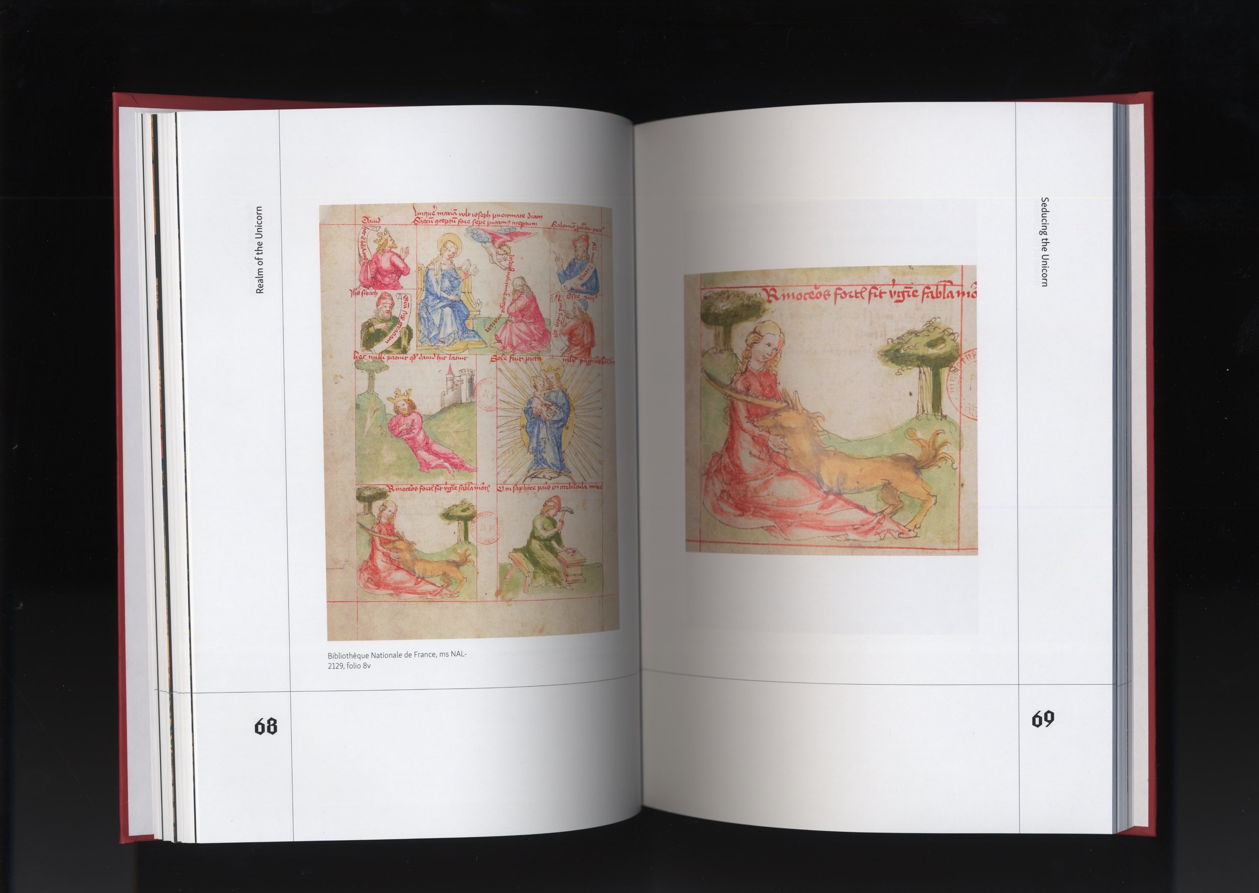
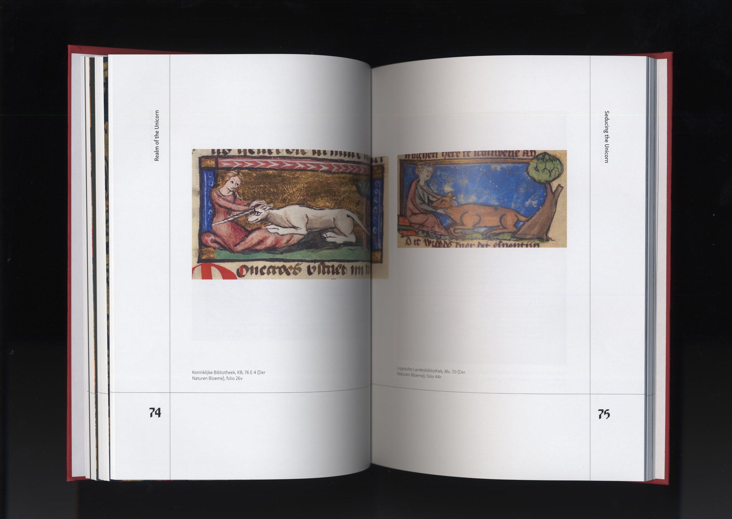
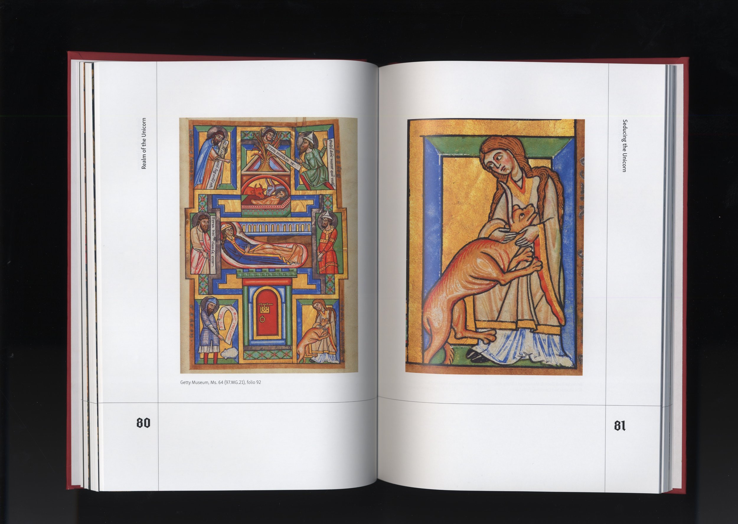
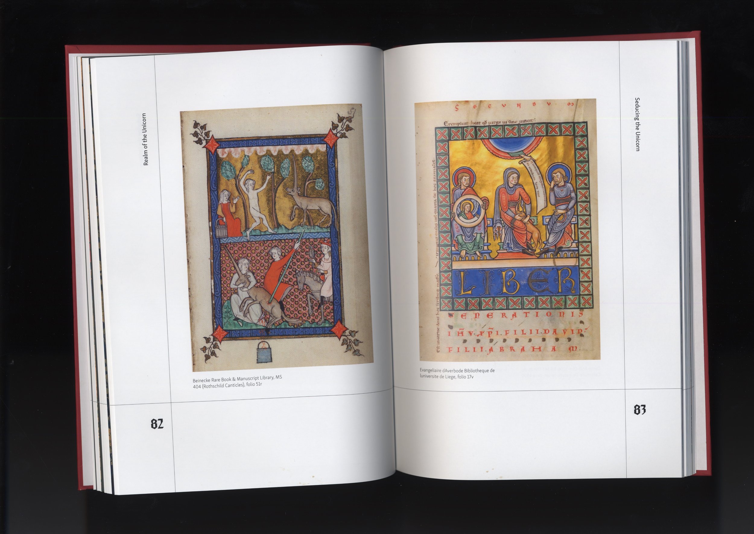
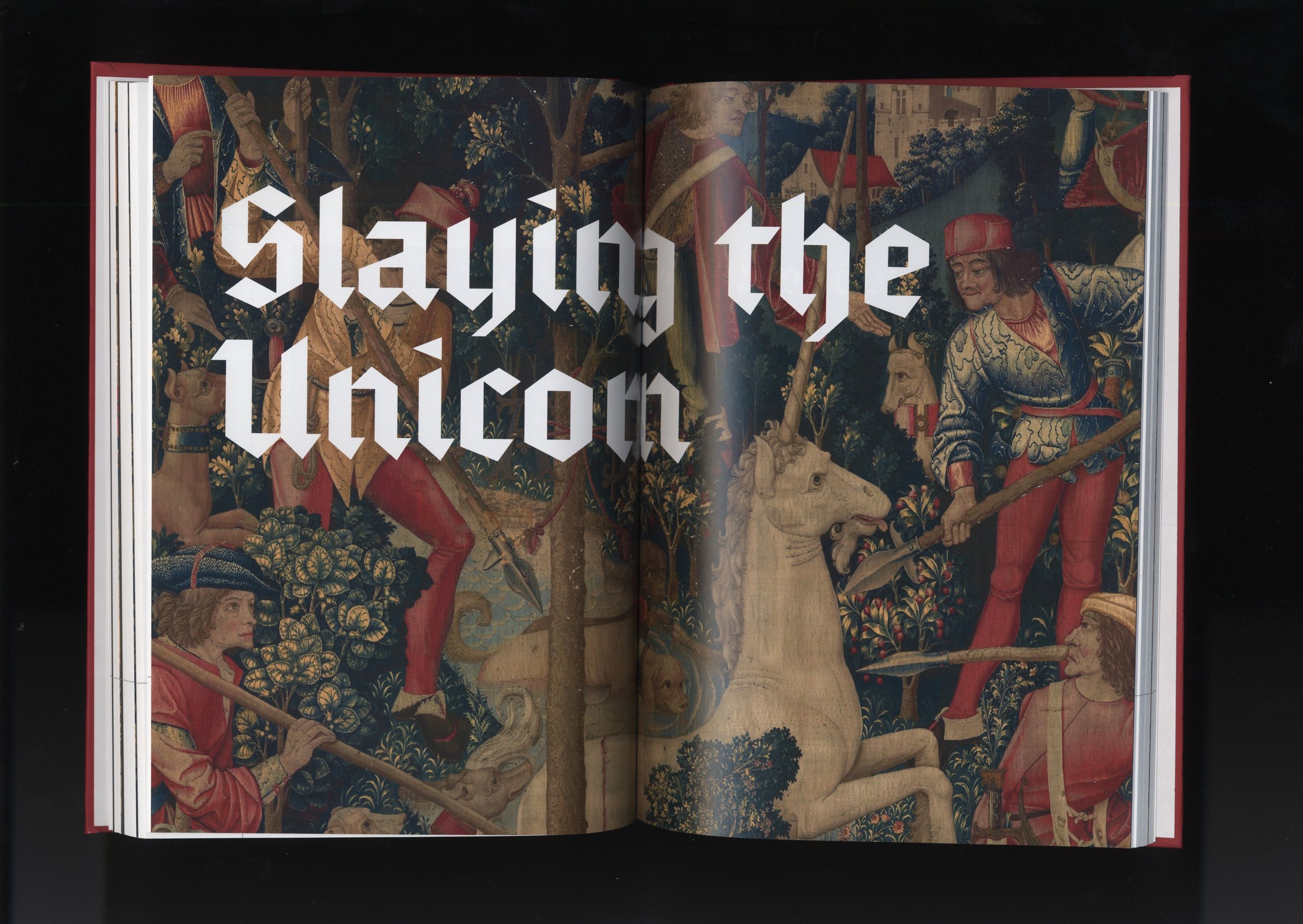
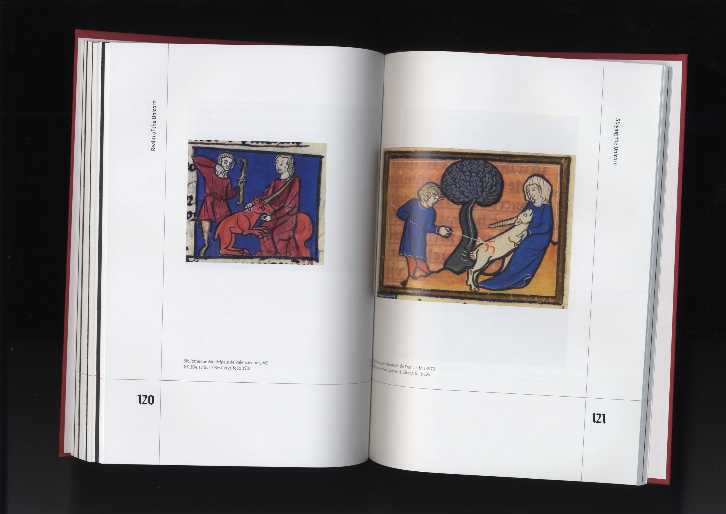
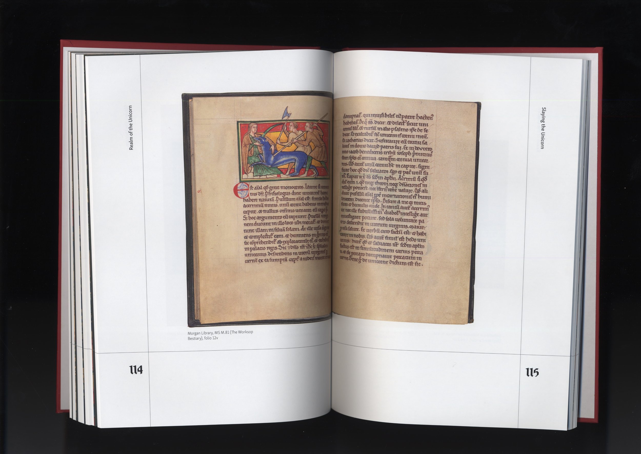
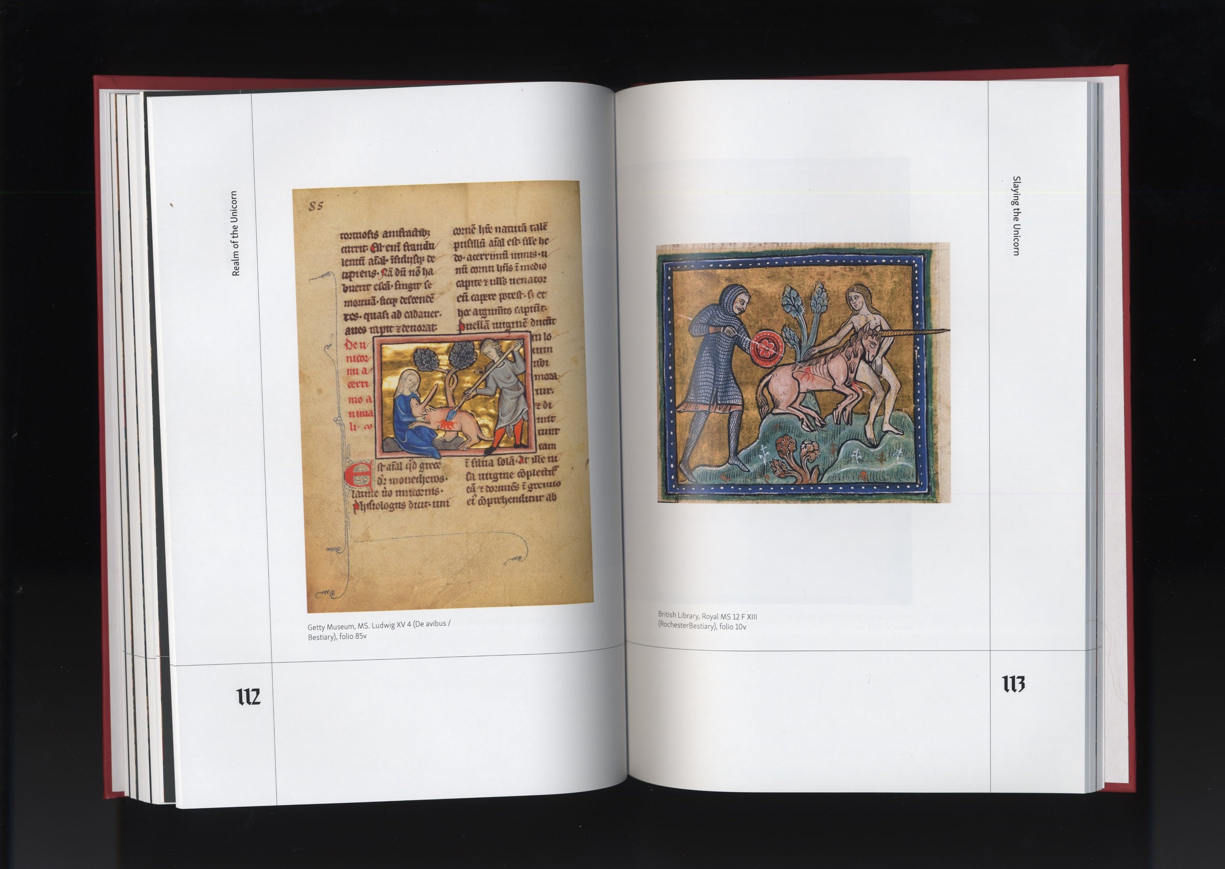
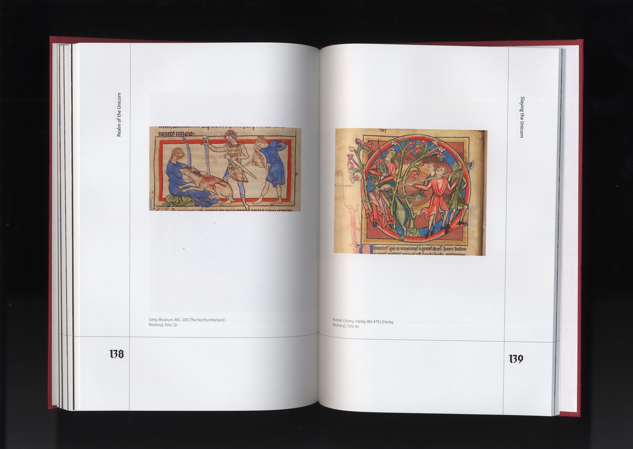
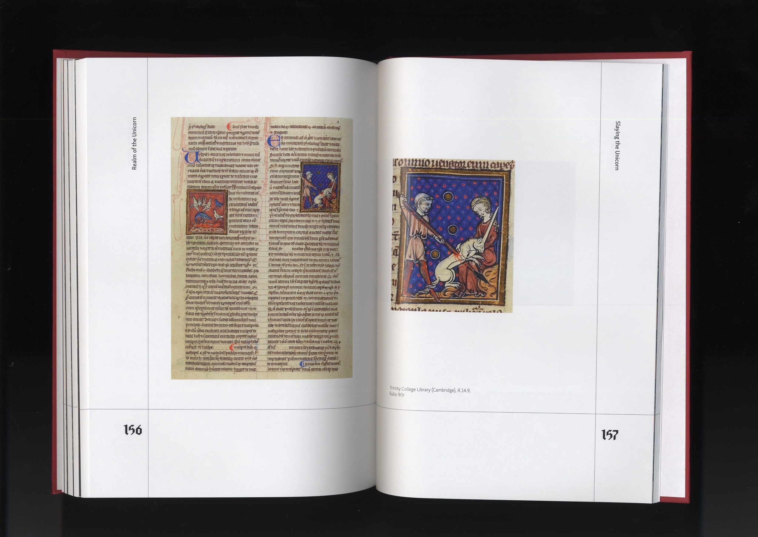
I focused on highlighting the diverse representations of unicorns in medieval manuscript art. To build the catalog’s content, I sourced an academic essay, wrote a foreword, and curated over 200 historical images from a variety of sources. As I examined these images, I noticed a recurring narrative structure: the unicorn is introduced, a fair maiden seduces it, and ultimately, the unicorn is slain. This discovery led me to organize the catalog into three distinct sections: Introduction, Seduction, and Slaughter. To further immerse the reader, I incorporated excerpts from a medieval German folk song that echoed this narrative arc.
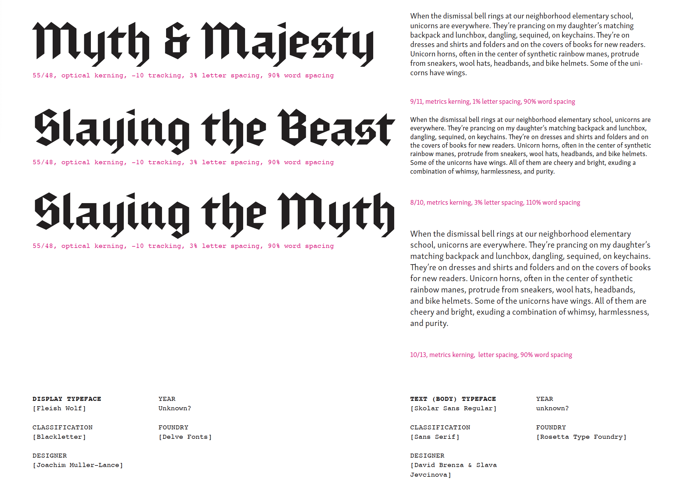
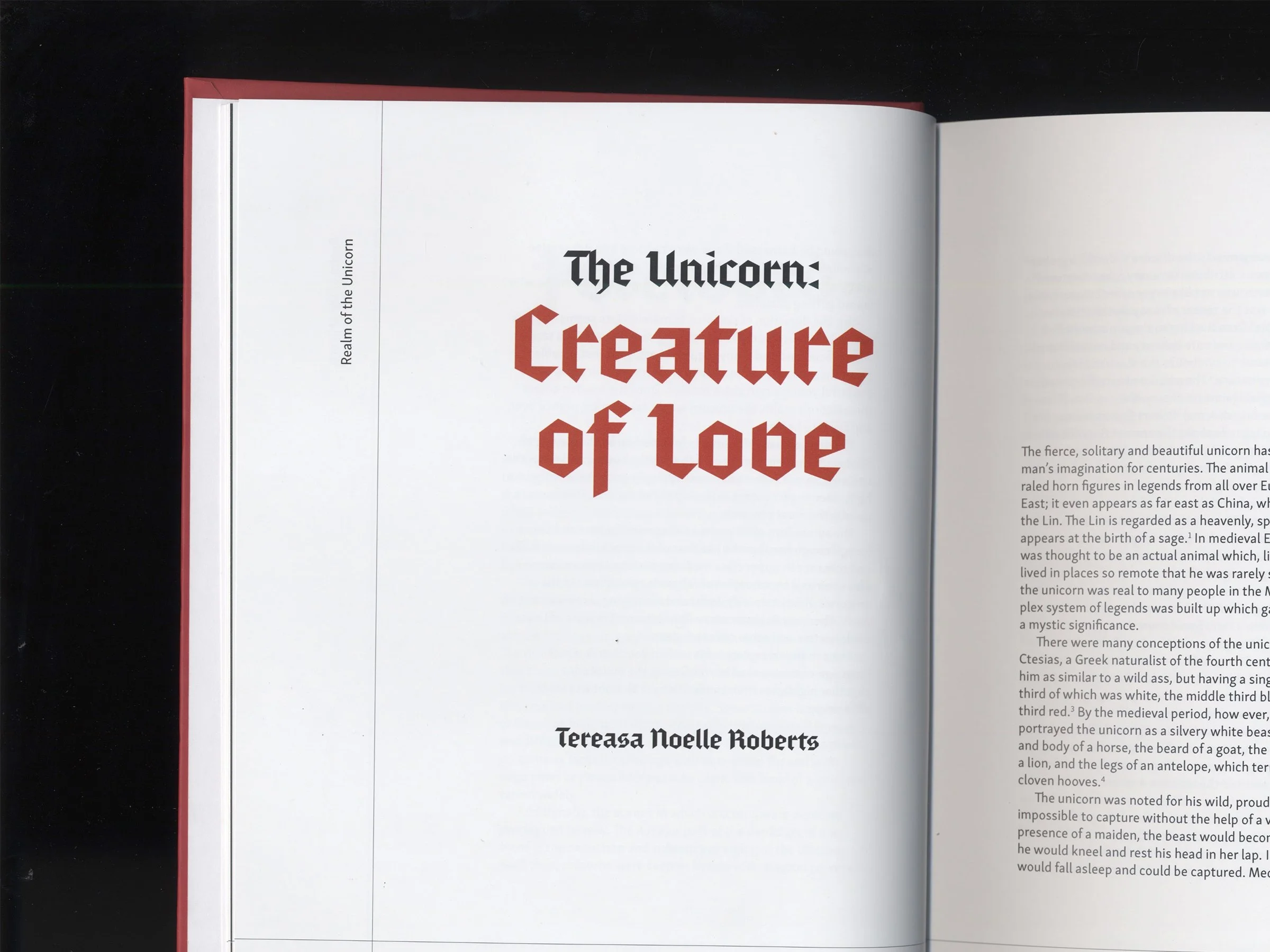
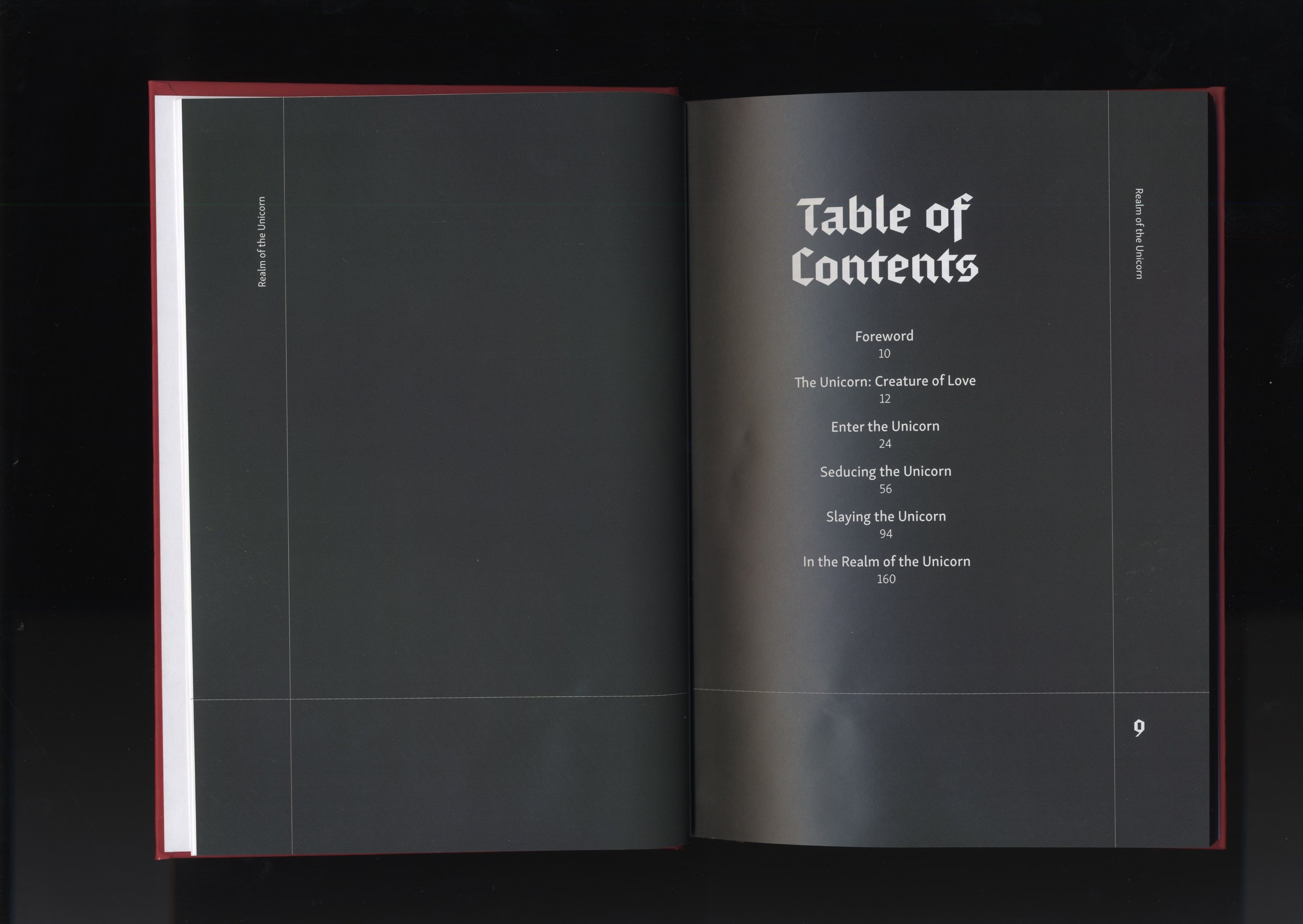
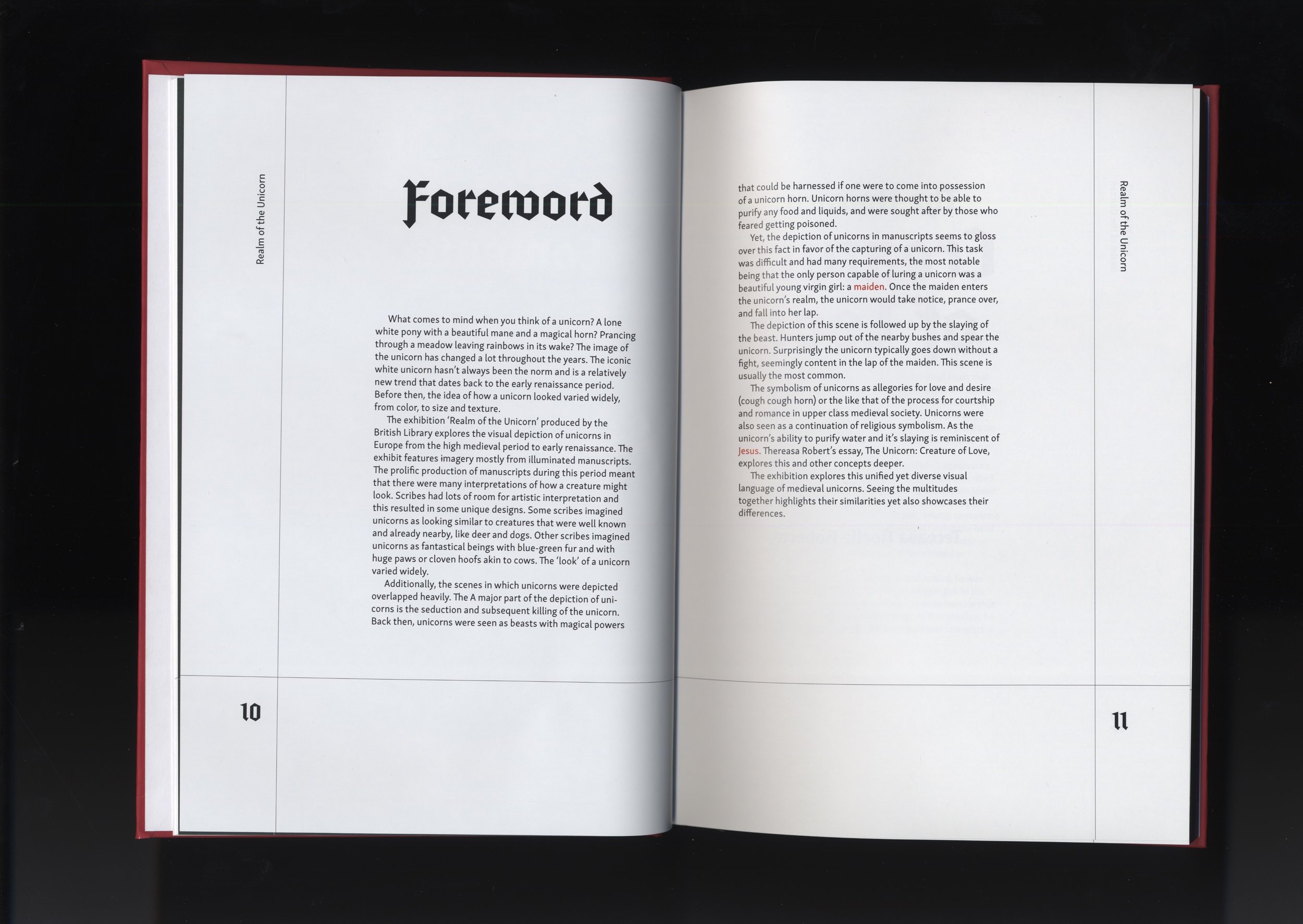
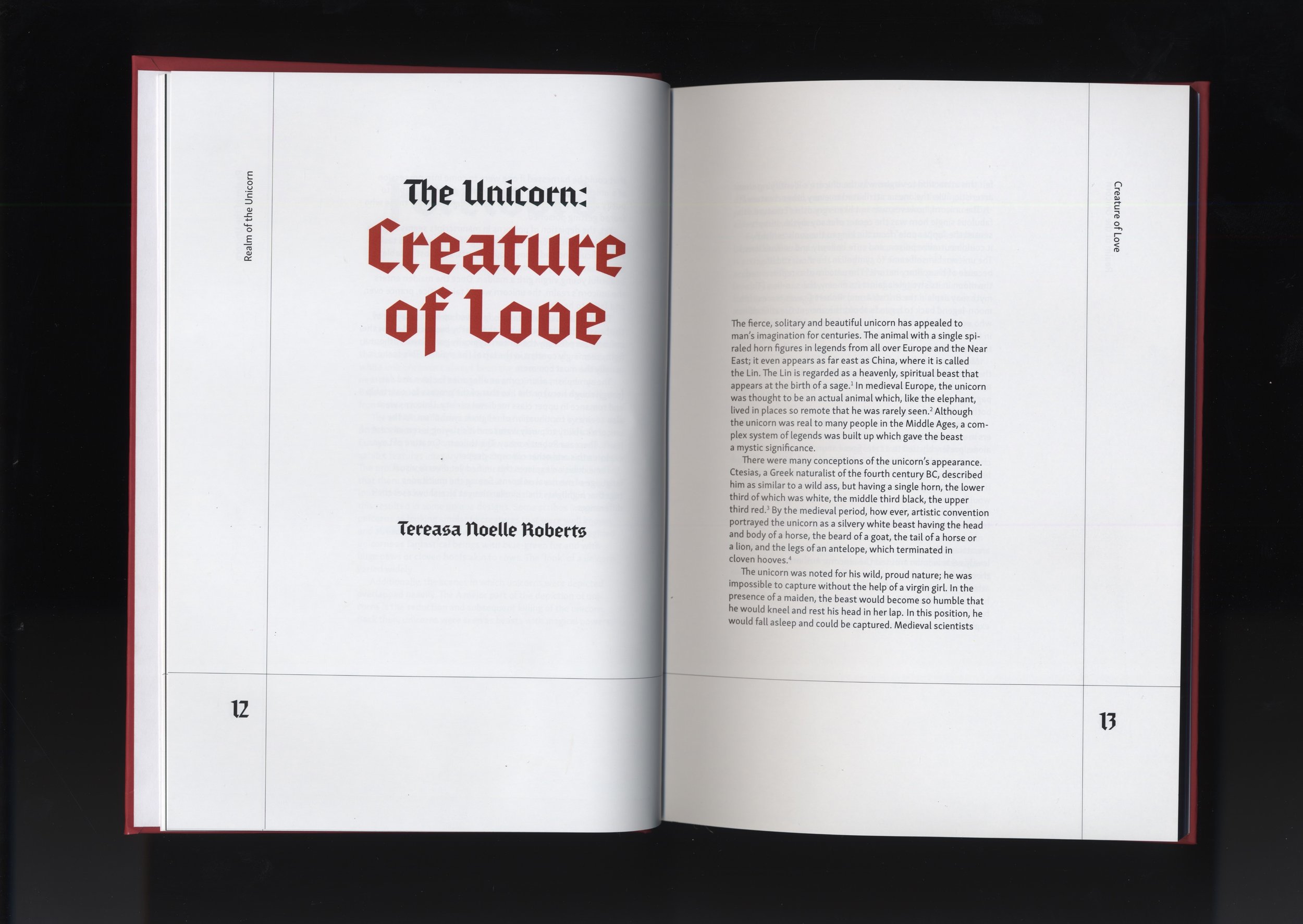
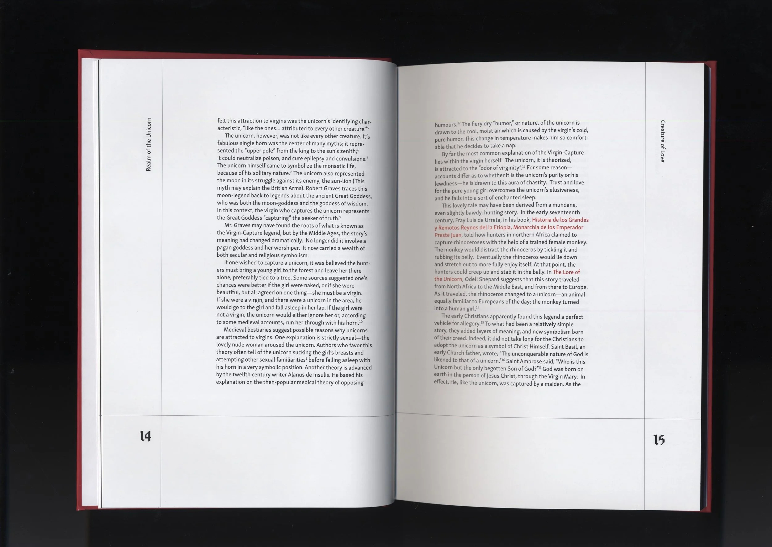
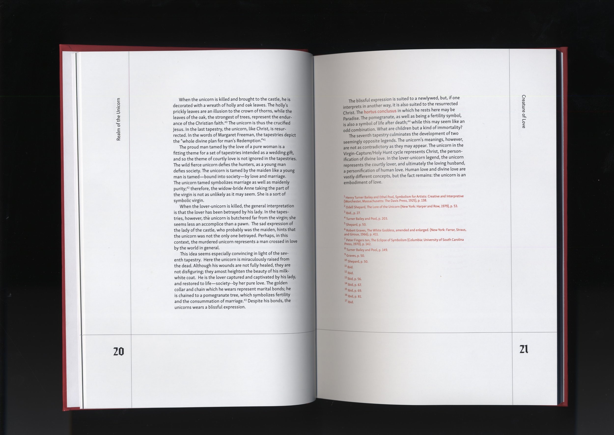
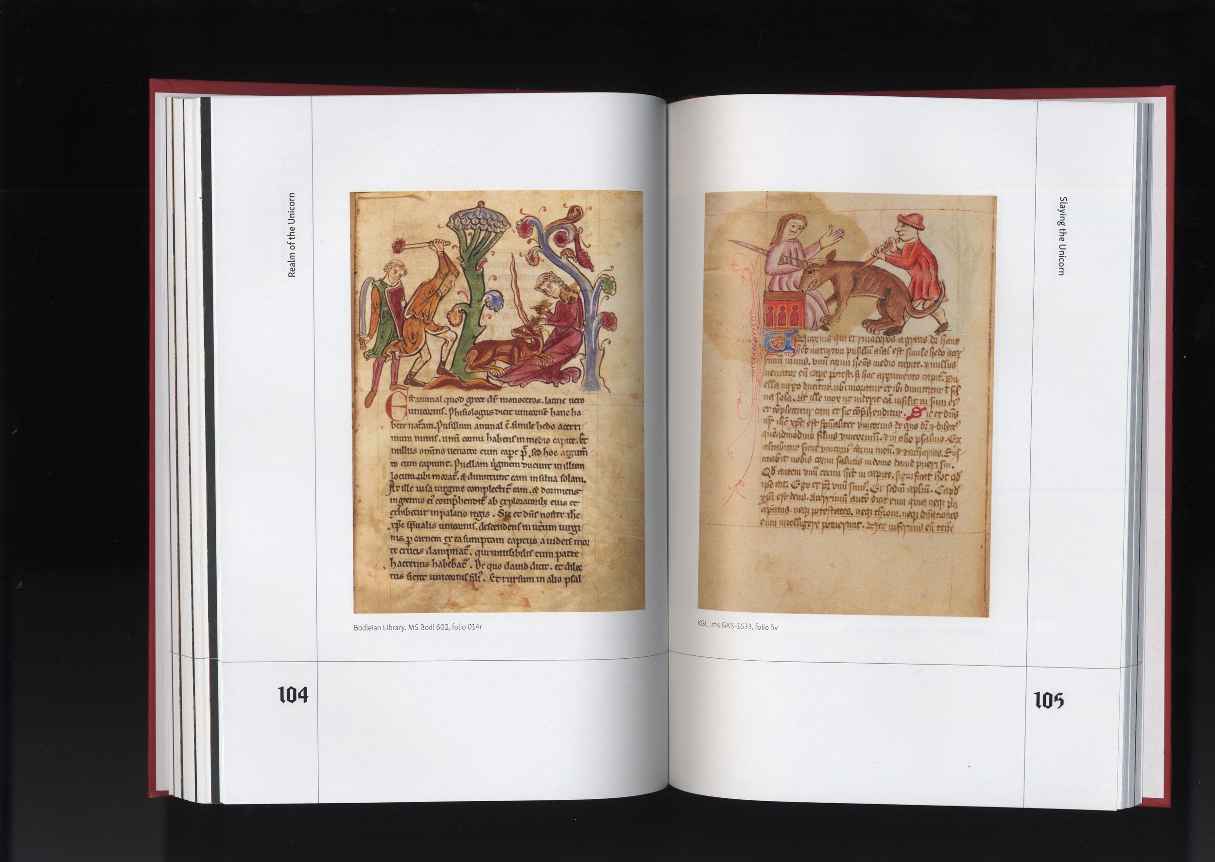
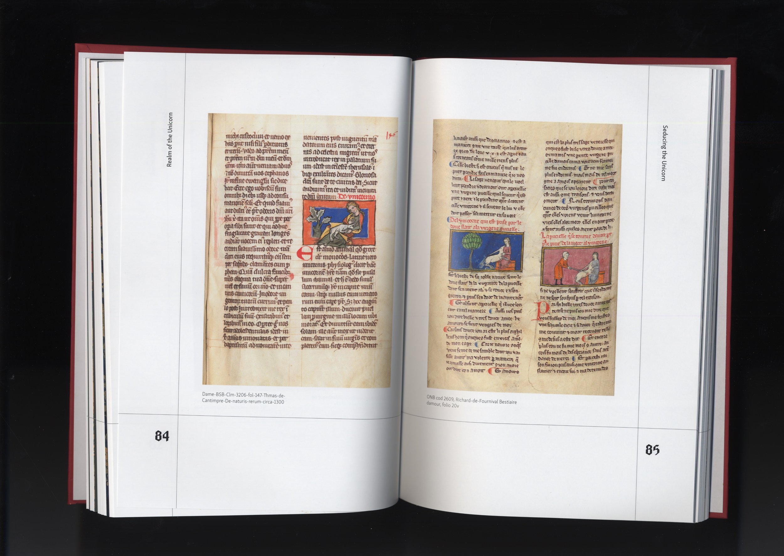
To pay homage to historical manuscript traditions, I designed the page layouts with ruled margins, referencing the medieval practice of prickling and ruling. For typography, I selected Fleisch, a modern and geometric interpretation of blackletter, paired with Skolar Sans, which added a contemporary contrast. After refining the typesetting, I adjusted ragging, resolved widows and orphans, and ensured proper punctuation before moving on to final production.
Final Design
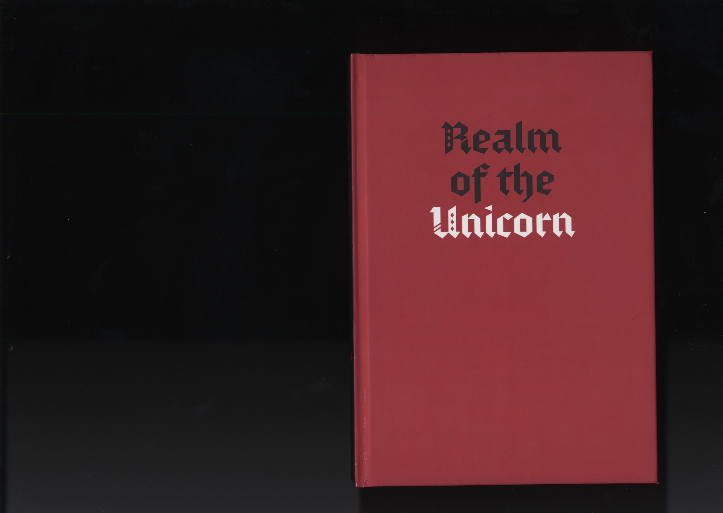
Once the final compositions were complete, I formatted the document for professional printing. After several weeks, the finished catalog arrived in its full 180-page glory!
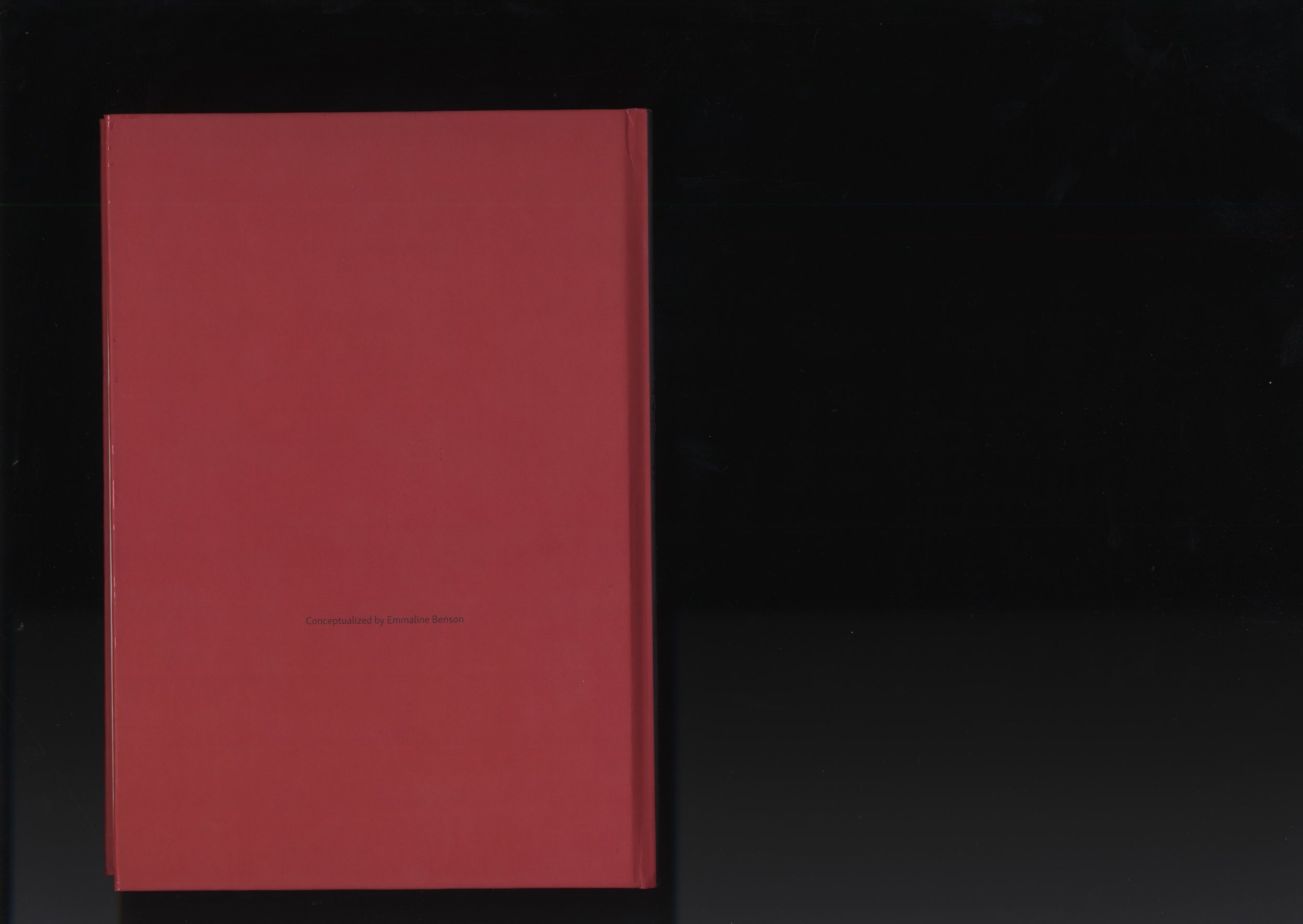
The documentation of the final piece was also a key consideration. I chose to photograph it in a way that mimicked how museums archive illuminated manuscripts, using a scanner to capture the pages as they naturally splay open. This subtle detail reinforces the catalog’s historical inspiration while showcasing the physicality of the final product.


Conclusion & Personal Takeaways
I absolutely loved working on this project, from diving into research and curating imagery to refining the structure and layout of the catalog. Along the way, I picked up new skills in InDesign, including the surprisingly powerful Table of Contents tool, which completely changed how I approach large-format documents. This project deepened my appreciation for the intricacies of book formatting and the many considerations involved in translating a digital design into a physical product.
One of my biggest takeaways was the importance of file organization when managing a large volume of content. Keeping track of over 200 images from various sources was a challenge at first, but developing a structured workflow made all the difference. Additionally, I learned a valuable lesson about designing with the interior gutter in mind. Since this catalog is relatively thick, some text that spans across both pages was lost in the binding, particularly in the section dividers and poem pages. Moving forward, I’ll be more mindful of how text interacts with the physical constraints of book design to ensure readability and a seamless experience.

