Human Rights Poster
Goal: Create a typographical poster for Amnesty International representing one of their Universal Human Rights.
Role: Design Lead
Timeline: 3 weeks
Typesetting | Layouts | Poster Design
Overview
This project aimed to communicate the relationship between an individual and their government through only typographic design. Through this process I practiced thinking conceptually and nesting big ideas with typography as my only visual design element, and I learned the fundamentals of hierarchy in poster design.
Research and Ideation
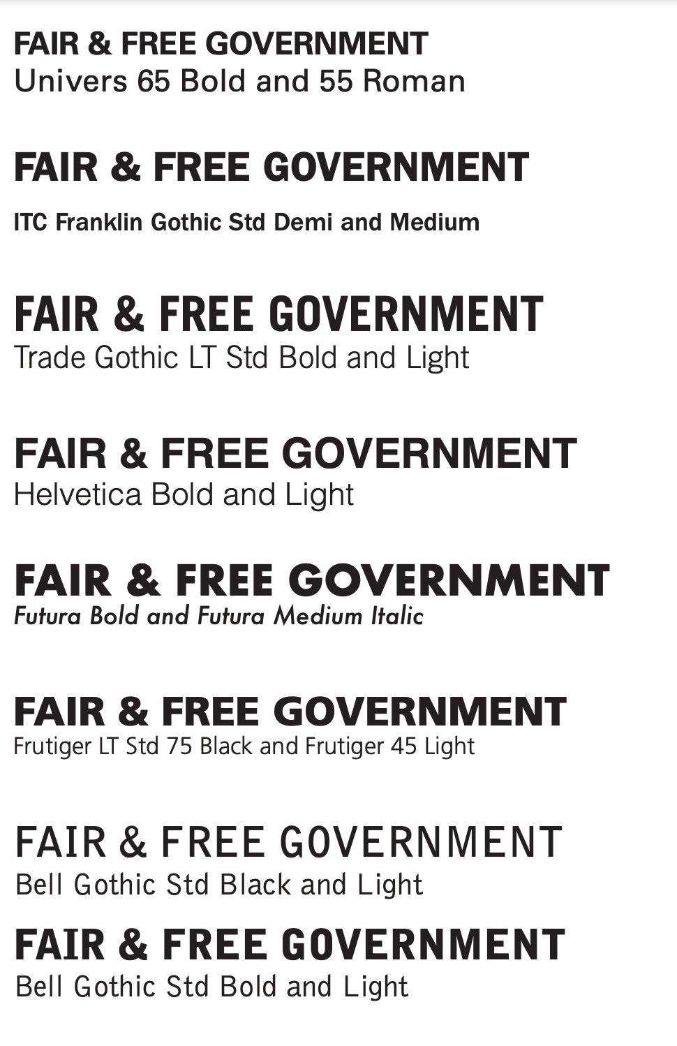
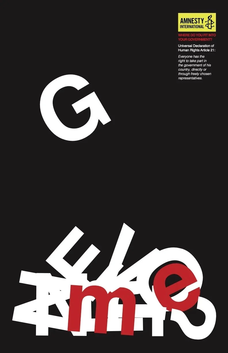
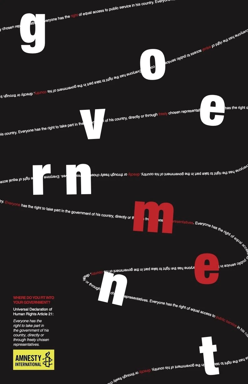
In this project, I created a poster representing Article 21, the right to take part and participate in one's government. I began by creating some type tests for possible font selections and chose Helvetica for its weighty and bold feeling. While developing my ideas, I zeroed in on ways to visually represent the relationship between an individual and their government. I noticed the word ‘me’ nested in government and explored ways to emphasize this detail.
Final Design
I created two layout variations to explore how different compositions affect understandability and the emotional response evoked by the design. Both designs are strong and have potential use in different contexts.
Conclusion & Personal Takeaways
This project challenged me to communicate big ideas through simple means. My only tool was Helvetica’s letterforms, so I had to think about how I might create an eye-catching composition that evoked tension while communicating a message.
I leveraged peer feedback throughout my design process, but in an ideal world, I would also incorporate user testing to determine whether the design evokes the desired tone and helps viewers understand the message.
Throughout this project, I honed my InDesign skills and learned and utilized grids to help make placement decisions that made sense. I have a newfound respect for the power of typefaces, and I became a Helvetica fangirl and chose to use it on this website. : -)


