
Trademark Design
Goal: Create conceptual trademarks for four different companies, with each trademark combining two ideas or images to represent the company and their mission
Role: Design Lead
Timeline: 4 weeks
Design Strategy | Visual Design
Overview
A trademark helps build a company’s identity and is an important part of telling a company’s story. This project gave me the opportunity to quickly create and execute conceptual trademarks for some existing and fictional companies.
Research and Ideation
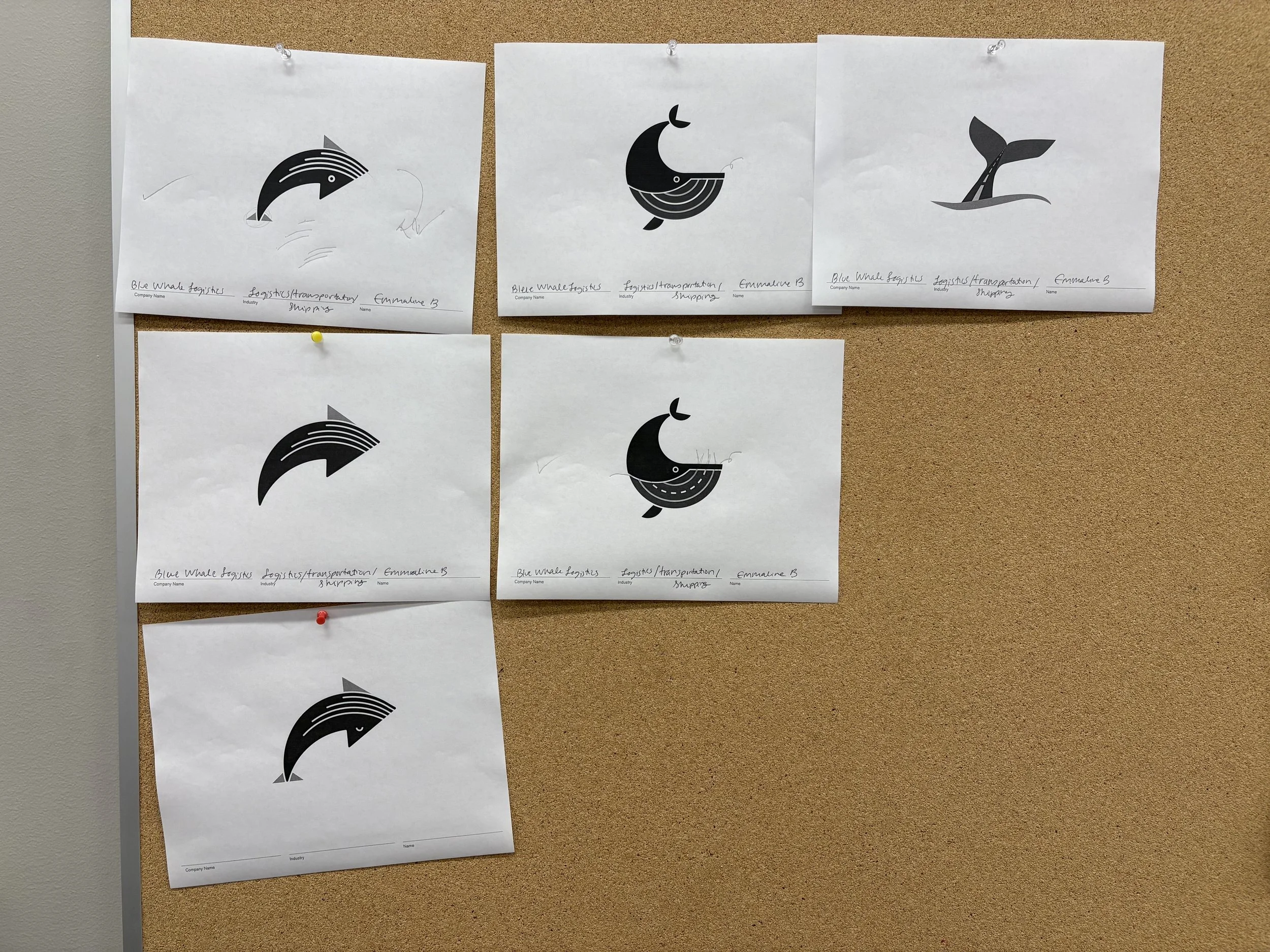
I started by developing a creative brief for each company to define the target audience, communication goals, value propositions, and desired tone. I created word lists and explored imagery options, and then moved into developing and refining hand-drawn sketches of logos. I translated hand-drawn logo sketches into digital format using Illustrator and added typography, ensuring that the logotype displayed harmoniously at small and large sizes. Peer design reviews informed design decisions throughout.


Final Designs
Monocerous Australian Whiskey
Monocerous Australian Whiskey is a distillery specializing in small-batch rye whiskey. Monocerous is the scientific name for an animal with just one horn, I chose to interpret this as a Rhinocerous. The negative space lines of the rhino’s limbs have rye sprouting up, referencing rye from the whiskey. To keep with a masculine and sophisticated tone I opted to focus on black and red color scheme with simple geometric shapes.
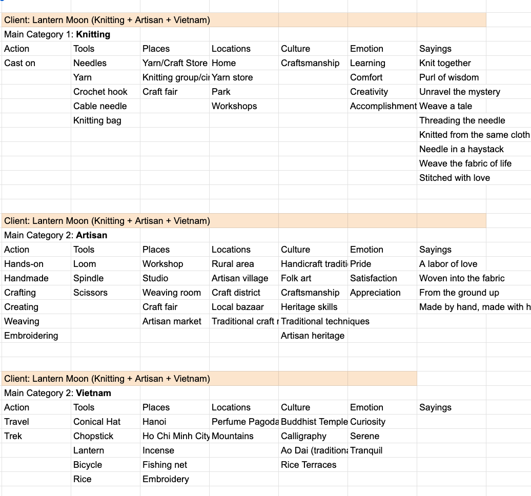
Lantern Moon
Lantern Moon is a knitting and crochet supply company originating from Vietnam. Their needles are handcrafted by artisans from premium wood. For this logo, I combined iconic Vietnamese lanterns with knitting and yarn imagery. The simplistic geometric pattern of the lantern references artisan woodblock patterns, imagery that Lantern Moon currently uses in their branding. Want to see their existing website? Check it out here.
Blue Whale Logistics
Blue Whale Logistics is a shipping and freight company from Ontario Canada.. For this logo, I combined an upward arrow with a whale’s body as it breaches through the water. I chose a simple and modern style for the whale to create a tone of trustworthiness.

Bird House Films
Bird House Films is a small group of indie filmmakers creating and telling short stories. This logo combines the image of a bird house with a roof made of film strips. To pay homage to the indie aspect of the group I gave the logo imperfect and roughened lines. Want to see their existing website? Check it out here.


Conclusion & Personal Takeaways
This project gave me an opportunity to flex and stretch my visual design skills while I practiced bringing together different concepts and finding patterns that enabled those concepts to combine effortlessly. I conducted scrappy user feedback through my design process, and in an ideal world, I would do this at scale to assess how well the designs communicated the intended ideas.
Through this project, I honed my Adobe Illustrator skills and importantly, learned to quickly crank out design ideas that aimed to connect with users. Learning to use Illustrator’s Polar Grid tool was a real ‘Aha’ moment!